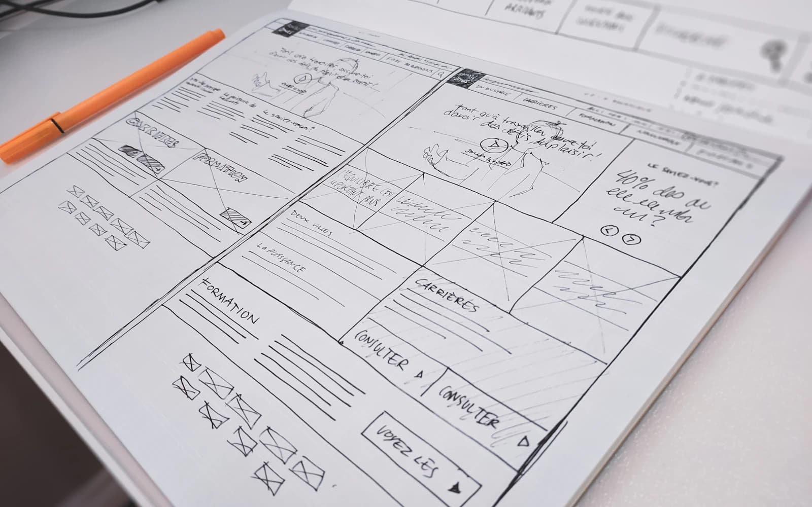
Audit a complete customer task, not just the appearance of a page. Combine observed attempts, error and completion data, accessibility checks and an interface review. For forms, investigate what users must understand, provide and recover from. Prioritise problems that prevent completion, then test whether the proposed change removes the difficulty.
When a form receives few submissions, the immediate suggestion is often to shorten it or make the button brighter. Either might help, but neither explains whether the person understood the offer, trusted the request, had the information available or encountered an error.
A UX audit should produce a defensible list of problems and changes. This guide combines a task-based usability review with a closer look at forms, where interface, content and backend behaviour frequently meet.
- An expert review identifies risks; observing users shows what actually happens.
- Form length is only one possible source of abandonment.
- Preserve entered information and explain errors and success clearly.
What is a UX audit supposed to uncover?
A UX audit examines how easily people can achieve a goal using an interface. Its scope might be an enquiry journey, a purchase, a booking change or an internal approval. Define that goal first so the review does not become a collection of personal design preferences.
An expert review can identify unclear labels, inconsistent controls and inaccessible interactions. It cannot establish how often a problem occurs or what every user will think. Treat findings as evidence-backed observations or hypotheses, and label which is which.
GOV.UK describes moderated usability testing as observing participants attempting specific tasks. It recommends realistic tasks that do not reveal the answer. That is a useful complement to an audit: watch what people do instead of asking whether they like the screen.
How do you choose a task and collect evidence?
Pick a high-value task with a clear start and finish. For an enquiry form, the start might be understanding whether the service fits; the finish is a confirmed submission with an understood next step. Stopping the audit at the submit button misses delivery failures and unclear confirmation.
Review available support requests and analytics, then observe likely users attempting the task with representative information. Include the devices and access needs relevant to the audience. Obtain appropriate permission for research recordings and use test accounts where personal data would otherwise be exposed.
Record what happened, where it happened and the consequence. “The design is confusing” is too vague. “The participant interpreted the company-size field as a required budget question and stopped” identifies a problem that can be investigated.
- Did the person know whether the service was relevant?
- Could they identify the next action without coaching?
- Did they have the requested information available?
- Could they recover from an invalid entry or failed request?
- Did they understand whether the task had completed?
Why do users abandon a form?
Abandonment has several possible explanations. The request may feel excessive, the benefit may be unclear, a field may be hard to answer, or the form may fail on a particular device. Some people are simply not ready to proceed. Do not attribute every exit to a design defect.
Map each field to a business need. Ask who uses the answer and whether it is needed now. If a sales conversation can establish a detail later, requesting it before an initial enquiry may create unnecessary effort. W3C’s forms guidance recommends asking for information required by the transaction or process.
Test the complete form with keyboard navigation, zoom, mobile input and relevant assistive technology. A visually obvious error can remain undiscoverable to someone using a screen reader; a date picker can be difficult even when the rest of the form appears simple.
| Observed difficulty | Possible cause | Useful test |
|---|---|---|
| Stops at a required field | Information unavailable or purpose unclear | Explain its purpose or defer it in a prototype |
| Repeats an invalid submission | Error is vague or hard to locate | Use field-specific guidance and an error summary |
| Submits several times | No clear pending or completion state | Test slow responses and duplicate clicks |
| Cannot proceed on a phone | Input, layout or control problem | Complete the task on an actual small device |
What should good validation and confirmation do?
Explain a field’s requirements before the user needs to guess. After an error, identify the problem and describe the correction in plain language. Associate the error with the relevant control, and do not rely on colour alone. W3C’s notification guidance covers clear error and completion feedback.
Preserve valid entered information when a request fails. A customer should not have to retype a long explanation because a server briefly became unavailable. Make the retry behaviour clear, and ensure the backend can distinguish a retry from a genuinely new submission where duplicates matter.
Confirm the actual result. If the server accepted an enquiry, say that and explain the next step. If it only received a subscription request, do not claim the person is already enrolled in a mailing system. A polished success animation cannot compensate for an unverified outcome.
How do you prioritise audit findings?
Use severity, reach, confidence and implementation effort together. A keyboard trap that prevents completion deserves attention even if affected users are underrepresented in analytics. A frequently requested cosmetic change may be less urgent than an intermittent submission failure.
For each finding, attach the evidence, affected task, proposed remedy and a verification plan. Separate the symptom from the suspected cause. “People leave at this field” is an observation; “the wording causes the exit” is a hypothesis until investigated.
Avoid scoring systems that make weak evidence appear scientific. A simple priority discussion with clear reasoning is better than an elaborate formula fed by guesses. The goal is to decide the next useful change and preserve the rationale.
What does a useful before-and-after example look like?
Imagine a fictional maintenance company whose enquiry form requires an exact equipment model. People requesting an initial assessment often do not know it. The audit observes users searching for paperwork, guessing or abandoning the task.
The proposed change permits “I’m not sure” and optionally accepts a photo later through an appropriate channel. The business still receives enough information to triage the enquiry, while the specialist gathers the model before giving equipment-specific advice.
This is an illustrative scenario, not a measured client result. Verification would examine successful submissions, the usefulness of received enquiries and any additional follow-up effort. More submissions alone would not establish that the revised form serves the business better.
How do you verify that the audit led to an improvement?
Retest the same task with appropriate participants after the change. Keep the goal consistent, but avoid teaching people the route beforehand. Record whether the original difficulty recurs and whether a new one appears.
Where traffic and conditions support quantitative comparison, define the measure and observation period in advance. Include quality measures such as accepted enquiries or correctly completed applications. Do not advertise a conversion uplift from a handful of sessions.
Finish with a maintained backlog rather than a report that nobody owns. SystemVale connects interface findings to implementation and verification, so a recommendation includes the behaviour to change, the person responsible and the evidence needed to close it.
Your next steps.
Choose one complete task and observe where people struggle.
Write findings as evidence, consequence, hypothesis and proposed change.
Retest completion, accessibility and the quality of the resulting work.
A little more clarity.
Is a UX audit the same as a redesign?
No. An audit identifies and prioritises problems. Its recommendations may involve wording, validation, performance or a small workflow change. A full redesign is only one possible response.
Should every form be reduced to three fields?
No. The right fields depend on the task and what the business needs at that stage. Remove or defer unnecessary questions, explain necessary ones and make difficult answers easier to provide.
Can a small usability study prove a conversion increase?
No. A small qualitative study helps reveal problems and understand behaviour. Estimating a reliable conversion effect requires appropriate quantitative data, sample size and a suitable comparison method.
Check the sources.
Primary references for the technical guidance above. Checked 12 October 2026.
Written by SystemVale
Practical guidance on software, AI and automation across our five core practices.
Explore UI/UX & Usability →